Monte Carlo Simulation in Excel - Uniform Distribution Tutorial
Monte Carlo Simulation in Excel - Discreet Uniform Distribution. How to run 1000 iterations in excel
6
views


Episode 51: Oz du Soleil & Global Excel Summit
http://excel.tv
Excel MVP Oz du Soleil discusses his presentation at the Global Excel Summit 2021. 'Taking Risks as a Content Creator'
2
views

Excel TV - Global Excel Summit 2021
Video created as part of the exhibition booth for the Global Excel Summit 2021
http://excel.tv - 50% off Coupon Code: ges2021
http://globalexcelsummit - Coupon code for 15% off for the virtual Global Excel Summit - Excel.TV-15%
7
views

Episode 50: Randy Austin - Excel for Freelancers
https://excel.tv/50-randy-austin-excel-for-freelancers/
Global Excel Summit Coupon Code: Excel.TV-15%
Check out this interview with Randy Austin of Freelancers for Excel. Randy discusses his business background, chats through how he found his passion for Excel, and how he turned it into a business that helps Freelancers. Randy also discusses how to focus on your Excel business by focusing on and defining your market, and getting in a regular cadence for your core delivery.
5
views

49: Theresa Estrada - Microsoft Principal Program Manager
Global Excel Summit dates moved to Feb 6-9, 2021 due to COVID. Is a virtual conference. https://globalexcelsummit.com/
The blog post - https://excel.tv/49-theresa-estrada-microsoft-principal-program-manager-lead/
1
view

Completing a Lesson - Excel TV Academy
https://excel.tv/excel-tv-academy-enroll-now/
For all of our Excel TV Academy members, this is how you complete lessons and modules within the Academy. This includes courses to make you a better analyst.
6
views

Start Watching a Course - Excel TV Academy
https://excel.tv/excel-tv-academy-enroll-now/
For all of our Excel TV Academy members, this is how start watching a course within the Academy or consuming any of the content This includes courses to make you a better analyst.
6
views
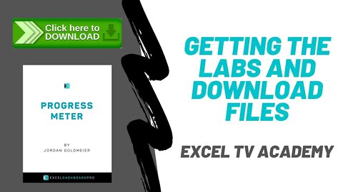
Getting the Labs and Download Files - Excel TV Academy
https://excel.tv/excel-tv-academy-enroll-now/
For all of our Excel TV Academy members, this is how you navigate to, and download all the labs and excel practice spreadsheets so that you can follow along with the courses.
8
views

Asking a Question - Excel TV Academy
https://excel.tv/excel-tv-academy-enroll-now/
For all of our Excel TV Academy members, this is how you ask questions once you are inside the Academy.
4
views
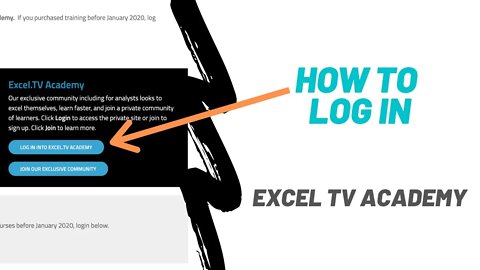
How to Login - Excel TV Academy
https://excel.tv/excel-tv-academy-enroll-now/
For all of our Excel TV Academy members, this is how you login to view all the Academy resources. This includes courses to make you a better analyst.
10
views
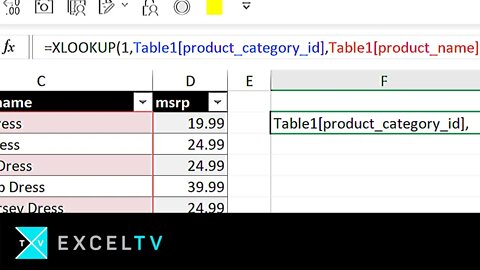
ALL Excel LOOKUPs explained
Download our guide on all Excel lookups:
https://excel.tv/all-excel-lookups-explained/
Go to excel.tv for more!
What did you think of this video? Leave your comments below.
Make sure to SUBSCRIBE NOW to receive updates regularly.
Over the years, I’ve noticed a lot of folks having trouble understanding Excel LOOKUP functions. By lookup functions, I mean LOOKUP, HLOOKUP, VLOOKUP, MATCH, and XLOOKUP.
So, in this video, I am trying to bring together what all of these lookup functions have in common. In this way, my hope is that you get a sense of the theory that comprise these functions. If you can understand the theory, then the old functions take on new meaning. Better yet, new functions like XLOOKUP make a lot more sense – and you’ll learn them in an instant.
You’ll see a lot of this in the video, but for now, let me see what I can summarize in this writing.
All Excel lookup functions follow this same framework. Let’s take a look at the VLOOKUP function:
VLOOKUP( what_we’re_searching_for, where_we’re_going_to_look, column_number_to_pull, the_match_type)
Now, let’s replace the following parameters from our VLOOKUP with symbols
🔎 = what_we’re_searching_for
🗄️ = where_we’re_going_to_look
… = column_number_to_pull
❓ = the_match_type
…and let’s put them back into our lookup:
VLOOKUP( 🔎, 🗄️, …, ❓)
Let’s consider “…” to refers to any optional parameter that is part of a lookup. And now let’s extend this idea…
The MATCH function, which returns the record location where a value is matched within a row or column follows a similar dynamic:
MATCH( what_we’re_searching_for, where_we’re_going_to_look, the_match_type)
… and we can assign the symbols as follows….
🔎 = what_we’re_searching_for
🗄️ = where_we’re_going_to_look
❓ = the_match_type
MATCH( 🔎, 🗄️, ❓)
In fact, we can summarize ALL excel lookup functions with the following axioms:
1. The first parameter 🔎 is always what you’re looking for
2. The second parameter 🗄️ is always where you’re going to look
3. The third parameter … represents additional options specific to that lookup type (MATCH has no options; VLOOKUP and HLOOKUP have options; XLOOKUP does as well, we’ll get to that in a second)
4. The final parameters(s) ❓ is/are always the match type(s)
Which means all Excel lookups following this generalized form:
LOOKUP( 🔎, 🗄️, …, ❓
3
views

File From Folder w Excel Power Query Tutorial
Get step-by-step instructions: https://excel.tv/how-to-power-query-file-from-folder
Check out our online academy: https://excel.tv/excel-tv-academy-enroll-now/
GET FILE FROM FOLDER
Get File From Folder is what Microsoft has named the functionality that lets you take multiple files and bring them together as one using Power Query.
Back in the day, the process to do something like this was very much VBA driven.
You would use something the File System Object to read every spreadsheet in a folder. You'd then use some code to reformat that data you pulled in and spit it out to a specific location in a File. This method usually worked, but it wasn't without its issues.
For one, there could be weird characters that you might not expect. A lot of development time was spent on trying to clean the data. Because if the macro crashed, that was usually the end of the whole thing. Going through an entire set of folders could take upwards of 15-30 minutes.
Power Query changed all of that. You no longer need macro code. And the resulting query created is really pretty cool.
In this video... We go through an example that was inspired by multiple clients.
Here's the background. A person who works in the field has to go to different field sites to run an audit. They create a report that comes back in a standard format. However, the format itself isn't really conducive to being analyzed. For instance, where they could have used a table that continues to grow down as more data is added, they instead used a table that would continuously grow to the right taking up more columns.
This is where Power Query really shines. It allows us to select a file in a folder of all the same reports - that file selected becomes an exemplar file. Then whatever type of transformation we do it that file, Power Query will perform the same transformations to all the other files in the same folder.
Once Excel is finished all of those transformations, Power Query then does what's called an append query. An append query will effectively stack tables. So if you have two tables with the same column fields of data in the same order, you would use the append query to perhaps tack on the rows of table 2 to table 1. Power Query does this for all the transformed tables in the same folder and creates one large table (named, by default, after the folder name).
The best part is how quickly it does this. Again, this used to be something I had to program pain painstakingly in VBA.
Watch the video to really get a sense of how to do this in your own. Then you can check out the instructions below I snagged from our academy.
(Yes, I'm admitting to being lazy and reusing the instructions - but they do a good job!)
Instructions to follow along
I have written sample instructions to follow along. https://excel.tv/how-to-power-query-file-from-folder
These instructions are actually part of our Excel TV Online Academy.
In the academy, I might be using different filenames. But the instructions are the same.
Click here:
Learn about Online Academy NOW:
Excel.TV Power Query Articles
We have lots of articles on Power Query. Check them out!
POWER QUERY – SPLITTING NAMES FROM SUFFIXES - https://excel.tv/power-query-cleansing-data-the-easy-way/
EXCEL DATA VISUALIZATION: PRESIDENTIAL APPROVAL RATINGS WITH SLICERS & POWER QUERY – CHART TRICKS - https://excel.tv/excel-data-visualization-presidential-approval-ratings-with-slicers-power-query-chart-tricks/
QUERY ACTIVE WORKSHEET – EXCEL POWER QUERY TIPS - https://excel.tv/using-power-query-to-connect-tables-for-reporting-excel-tv/
USING POWER QUERY TO CONNECT TABLES FOR REPORTING - https://excel.tv/query-active-worksheet-excel-power-query-tips/
UNPIVOT WITH POWER QUERY - https://excel.tv/unpivot-power-query/
Could you see yourself combining files together into one table?
Let us know in the comments.
And, as always, keep on Excel'n.
15
views


Launching Excel TV Academy - First 24 Hours
Excel TV Members-Only Site now available
https://excel.tv/excel-tv-academy-2/
Our community is the number one place to get access to Excel experts like Jordan. Right now, community members will receive instant access to our core products - Excel Dashboards Pro and Excel Business Champion. For only $19/month FOR LIFE for the first 100 members.
2
views

Oz's Excel Tip: Keep a Workbook for Random Data in Excel
Welcome back to another episode of Excel.TV where Oz his major Excel tip. Here it is: always create a workbook with random data.
Oz didn't feel like sharing his workbook, but if you'd like here are some videos and tutorials you can use to help you create a fake data worksheet!
https://excel.tv/ozs-excel-tip-keep-a-workbook-for-random-data-in-excel/
CREATING RANDOM DATA IN EXCEL USING RANDBETWEEN AND CHOOSE
https://excel.tv/creating-random-data-in-excel-using-randbetween-and-choose/
Creating Fake Data in Excel: random dollar amounts & dates using RANDARRAY & TEXT
https://www.youtube.com/watch?v=zhNf8EnzU-E
How to Create Sample/Dummy Data Sets in Excel
https://www.youtube.com/watch?v=RERDNtjG7w8
Dummy Data – How to use the Random Functions
https://chandoo.org/wp/dummy-data-random-functions/
Creating Sample Data Sets for Excel Spreadsheets
https://www.consultdmw.com/create-excel-data-set.html
Mockaroo (this is what I use!)
https://mockaroo.com/
Generate Data Using Excel: RAND & RANDBETWEEN
https://datascopic.net/generate-data/
6
views

Oz and Jordan talk Global Excel Summit - has everything in Excel been done before?
This week, Oz du Soliel stops by to share with us his thoughts and insights about the Global Excel Summit. If you've not met Oz before, he is a tour de force. You can find him over on his YouTube channel Excel on Fire - https://www.youtube.com/user/WalrusCandy
Oz du Soleil is an Excel.TV alum/emeritus. He was an instrumental part of the original Excel.TV show. We're always happy when he stops by.
We would love to catch you at the Global Excel Summit. Learn more by following this link - https://globalexcelsummit.com/#tickets
This is part 1 of a multiple videos we will be releasing over the next coming weeks.


Monte Carlo Simulation in Excel - Poisson Distribution
blog post and downloadable file -- https://excel.tv/monte-carlo-simulation-excel-poisson-distribution/
Monte Carlo Methods or Simulations are often difficult in Excel and people rely on add-ins or other software to perform the analysis. This can be even more difficult when dealing with distribution curves that don't follow the standard "bell curve". This tutorial video helps you perform Monte Carlo Simulation in Excel using the Poisson distribution. The tutorial shows you that it is simple to do with the use of VLOOKUPS, distribution functions and random number generators in Excel.
8
views
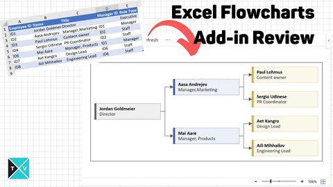
Microsoft Excel Visio Data Visualizer Add In for Excel: My Review
FREE EXCEL VISIO DATA VISUALIZER GUIDE: https://excel.tv/microsoft-excel-visio-data-visualizer-add-in-for-excel-a-quick-guide/
I wanted to let you know about a really cool new add in for Microsoft Excel. This is one of those modern add-ins you can download from the Microsoft store.
This add-in can allow you to easily create hierarchy type process maps and flow charts. The free version creates standalone type charts. The paid version, the one Microsoft would like you to buy, connects you to the online Visio service. The idea is that you can create a process map in Excel, automatically generate an editable Visio file, and then integrate that into Power Point.
Today, I'll only deal with the *FREE* version.
How to install the Microsoft Excel Data Visualizer
You can install Data Visualizer to your Office 365 installation. Go to Insert / Get Add Ins. Search for "data visualizer." When you see the Microsoft Excel Data Visualizer tool, select Add. Once installed, you'll need to login with your Office 365 Account to gain access.
To insert a new diagram, go Insert / My Add-ins and select My Add-ins / Microsoft Data Visualizer.
Diagram Types
The are three diagram types available. These types are as follows: Basic Flow Chart, Cross-Functional Flowchart, and Organization Chart.
Cross Functional Flow Charts
There are five default flowchart types for Cross Functional charts. Sometimes these are referred to as "swim lane" charts. Here are the defaults:
Organization Chart
There are five organizational chart types. These charts create hierarchies useful for modeling organizational structures. However, with some additional work, you could adapt the problem to alternate hierarchies.
Editing a Hierarchy
I won't go through each type in this guide. However, no matter which type you select, several options are available in each diagram type by editing the Excel table.
For the most part, you can edit the following parts of the diagrams: Connections to other Objects, Captions, Object Shape and Color, and Connection Labels.
Editing a Caption
Each diagram allows you to edit one or more captions. In the hierarchy example, you can edit each title by changing the Process Step Description. Again, this column name might change depending upon the chart type selected, but it should be fairly obvious which column holds the information.
Editing an Object Shape and Color
Most diagram options will have a preloaded set of categorical designations. These will change the color and shape of each object. I think some of them follow flow chart norms.
Editing a Connection Label
You can also edit a connection label in several charts. This will allow you to change the label next to the connection arrow to the next job. If you think of a decision flow diagram, the standard connection labels for a decision are "Yes, No." You'll see columns like Connector Label that will allow you to set the label. If you have multiple connections separated by a comma, each comma separated label will be applied to them respectively. (You can see an example of this in the video above.)
Overview of the Visio Flow Chart
This section provides an over view of the actual flow chart. There are multiple buttons on and interactive items on the chart. The image below provides a description of the layout.
Note that you can edit, refresh, change the zoom level and view expanded options.
Edit Button
This button is a bit of a misnomer as you are able to edit the chart on the spreadsheet itself. However, if you have one of those expanded Office 365 licenses (don't ask me which one, I can barely figure out my current license -- all I know is that it doesn't include Visio), you can actually edi the the file itself as a visio file. That would give you significantly more control over color, fonts, and more.
Refresh Button
After each change to the Excel table, you'll need to hit Refresh to see the result. I'm told this will be upgraded to automatically refresh. Until the, you'll be clicking this button a lot.
Zooming
You can zoom in and out using the zoom slider. If you want to reset the zoom, you can select the zoom to fit button.
Expanded Options (Delete Button)
The expanded options menu contains additional support items. It's also where you can delete the visio chart if you don't want it anymore. You can also show it as a saved image.
25
views

Advanced Excel Zoom-In Pivot Table Timeline Chart: Raw & Uncut
Download File - http://excel.tv/highlighted-timeline-chart-in-excel-without-vba:-raw-and-uncut/
FREE Excel Power Users Guide - https://excel.tv/free-power-user-quick-guide/
FREE Data Modeling Webinar - https://events.genndi.com/register/169105139238466805/bd3b7fc07e
FREE Dashboard Webinar - https://events.genndi.com/channel/excel-dashboard-webinar
FREE Excel Consulting Tips - https://excel.tv/consultants-corner2/
XL TRAINING - https://excel.tv/training - Code: 20PERCENTOFF
I built a chart that let’s you highlight a series from a smaller chart (take a look at that the chart under the timeline) and show it in more detail on a larger chart. Yahoo! Finance used to have something similar, although I can’t find it anymore. But anyone who has looked up stocks online ought to be familiar with this type of dynamic.
Building this was significant for me in that it accomplished a few things:
We were able to build a really awesome interactive chart simply using Excel’s internal features and functions. There was NO VBA. It uses Pivot Tables. I am not always a huge Pivot Table fan, but I surprise myself sometimes. Although, to be fair, we only use Pivot Tables because of the limitation imposed that slicers can only work on PivotTables. Power BI doesn’t (yet!) have something like this. I’m not trying to be the last island still fighting the anti-Power BI war long after the Excel space has moved on. But just remember, if you’re caught in between Excel and Power BI it’s reflective of the current transition. In other words—there are still things Excel can do that Power BI cannot.
So let’s take a look at the mechanisms that drive this interaction. Here are my step-by-step instructions to build this chart.
Step 0 - The Dataset (not really a step?)
The dateset I’m using is a timeseries of the frequency of tornadoes per month from 1945 to 1994. That dataset is incorporated into an Excel table that serves as the backend database for the dashboard.
Step 1 - Placing a Pivot Table
The next step is create a Pivot Table off of this data. Include the date in the Row Values field and the Value in the aggregation field. If that happens, right-click anywhere in the pivot table. And select ungroup.
Step 2 – Add a Pivot Chart and Timeline
Once the Pivot Table is built, you can add a Pivot Chart and Timeline (Insert _ Timeline).
Step 3 – Find out the minimum and maximum dates filtered in the Pivot table.
In our backend data, we create three different values to track: The Minimum Date from the pivot table—which is the beginning date of the timeline’s selected region; The Maximum Date from the pivot table—the ending date of the timeline’s selected region; The Maximum Value of the total series—that’s going to be the month with the greatest frequency of tornadoes.
The following image shows how we get the minimum date. We'll use a similar formula for the max date. The Max value will pull the max from the Excel Table.
Step 3 – Use the original table to create two series that will give the highlight effect of the overall series.
In this step, we create two additional columns to the backend Excel Table: Highlight Series and Highlight Background.
In the Highlight Series column we test if the current date is within the range identified by the timeline. If it is, we have that value returned otherwise we generate an NA() error. NA()s won’t be mistakenly plotted by the chart. You can see in the image (well, just barely, but it's there!), values outside the range come in as an #NA.
In the Highlight Background column, we repeat the Max Val (399 in this case) where the Highlight Series is not #NA(),; otherwise, we return a zero. I use a Boolean formula to achieve this. Take a look at the next image.
Step 4 – Create the chart by combining Value, Highlight Series, and Highlight Background
At this point, you can create a line chart based on values you’ve been putting together. The continuous time series reflects the Values series; the red highlight can be traced to the Highlight Series column; and, the Highlight Background series is the green that lumps up and forms the highlight.
Step 5 – Convert the highlighted background line chart to a column chart.
Notice that the highlight is currently a line chart and doesn't look very good. So we'll neex to fix that.
Right-click onto the Highlight Background series and select Change Series Chart Type. Change the Highlight Background series to a clustered column and then hit ok.
Finally, right click on the Highlight Background series and go to Format Data Series. Set the Gap Width to zero to achieve that continuous effect.
Step 6 – At this point, it’s just a matter of copying and pasting that chart onto your dashboard. Format the chart as you’d like!
61
views
R are Power Query are the same thing (RAW + UNCUT)
Welcome to another raw and uncut video. I wanted to put something together to explain how Power Query and R actually have a lot in common. Sorry about the echo - I got a new computer and I really haven't figured out what that's about.
Check us out: excel.tv